 "Harris Lue" (luecreative)
01/21/2014 at 18:01 • Filed to: Graphic Design, Porsche, 911, Carrera, 1985, Whale Tail
 8
8
 18
18|
"Harris Lue" (luecreative)
01/21/2014 at 18:01 • Filed to: Graphic Design, Porsche, 911, Carrera, 1985, Whale Tail | 8
| 18 |
First draft of one side of my Postcard Project for my Graphic Design class this semester.
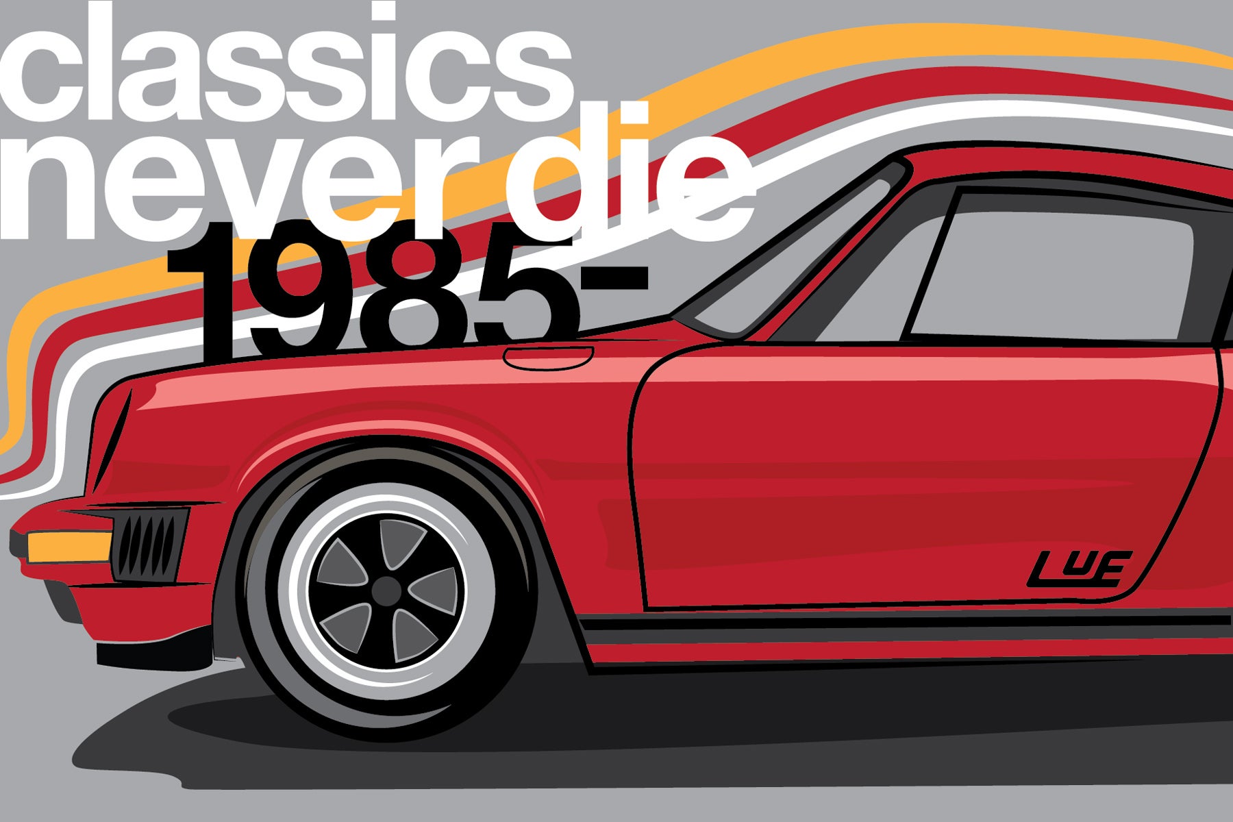
This is going to be a 4 color print with metallic silver ink as well. So anything silver on here will be metallic.
The words aren't set yet, just needed some type to play with.
The back is going to be two color Florescent Orange and black and I plan on making a Classic Gran Prix poster style design for that.
 A3R0
> Harris Lue
A3R0
> Harris Lue
01/21/2014 at 18:03 |
|
This is beautiful!
|
Harris Lue
> A3R0
01/21/2014 at 18:05 |
|
Thanks buddy! I cant wait to experiment with the metallic ink and Gloss coatings!
|
A3R0
> Harris Lue
01/21/2014 at 18:06 |
|
Try and send it to Blipshift. 10/10 would buy on a shirt.
|
A3R0
> Harris Lue
01/21/2014 at 18:07 |
|
Try and send it to Blipshift. 10/10 would buy on a shirt.
|
Harris Lue
> A3R0
01/21/2014 at 18:07 |
|
That's a good idea! Need to complete the whole car and send it in!
 ddavidn
> Harris Lue
ddavidn
> Harris Lue
01/21/2014 at 18:17 |
|
Very nice. I have a feeling the credit goes more to your natural talent than your graphic design class.
 NoahthePorscheGuy
> Harris Lue
NoahthePorscheGuy
> Harris Lue
01/21/2014 at 18:21 |
|
Love it. The Fuchs are a little funky though. Wore my Wagon Wheel shirt today.
|
Harris Lue
> ddavidn
01/21/2014 at 18:21 |
|
Well, thank you! I came into school with quite a skill set under my belt, but I have improved drastically thanks to the expertise and guidance shared thru my classes and the teachings from my professors.
|
ddavidn
> Harris Lue
01/21/2014 at 18:22 |
|
That's the best way to do it. I wish I was talented in this respect. Someday I'll have the time to work at it.
|
Harris Lue
> NoahthePorscheGuy
01/21/2014 at 18:23 |
|
Yeah, this is just a first draft and a progress shot really, so the wheels would be heavily tweaked for the final version! That's awesome man! Ive got mine ready to wear tomorrow.
 NinetyQ
> Harris Lue
NinetyQ
> Harris Lue
01/21/2014 at 18:25 |
|
What is "1985" a reference to? I'm probably missing something, but the 911 began in the '60s, so I'm sure you're referring to something else.
|
Harris Lue
> ddavidn
01/21/2014 at 18:27 |
|
That's all it takes is time! Unfortunately that's the one thing we all seem to have the least of... Vector art is a pretty simple concept fortunately. Just begin by reducing the form into it's most basic shapes(Here the body colored area and the base shadow) then build up from there adding more subtle and simplified detail as you go. It's easy to start doodling in your free time using this simplify and build technique to get your brain used to thinking this way.
|
Harris Lue
> NinetyQ
01/21/2014 at 18:28 |
|
I based this on a 1985 model. That's the only reason! The type is not set in stone so I will probably change it to the year of the 911s origin, just to avoid confusion.
|
ddavidn
> Harris Lue
01/21/2014 at 18:30 |
|
Yes, we all have to choose our priorities carefully. That's for sure.
I need to get my digital tablet out again. I doodle on paper and it looks like crap (also my handwriting is terrible) but on the computer, a little bit of correction (the new pencil tool in Illustrator is very nice for this) can make me feel 200% more confident.
|
Harris Lue
> ddavidn
01/21/2014 at 18:39 |
|
My handwriting is virtually illegible, so I know what you mean! I rarely do anything serious on paper anymore and if I do it gets scanned into photoshop or illustrator. Still haven't mastered tablet drawing yet, but they're really fun to work with for vectors and painting.
|
ddavidn
> Harris Lue
01/21/2014 at 18:43 |
|
I mainly just use it for photo retouching if I'm going to go in and edit it heavily (but hopefully tastefully). Ever since working with film in a darkroom, the tablet has felt very natural for dodge/burn adjustments.
 DeltawingGothamDeserves
> Harris Lue
DeltawingGothamDeserves
> Harris Lue
01/21/2014 at 19:46 |
|
Submit it to Blipshift!
 NeilR
> Harris Lue
NeilR
> Harris Lue
01/22/2014 at 17:07 |
|
Blipshift worthy.